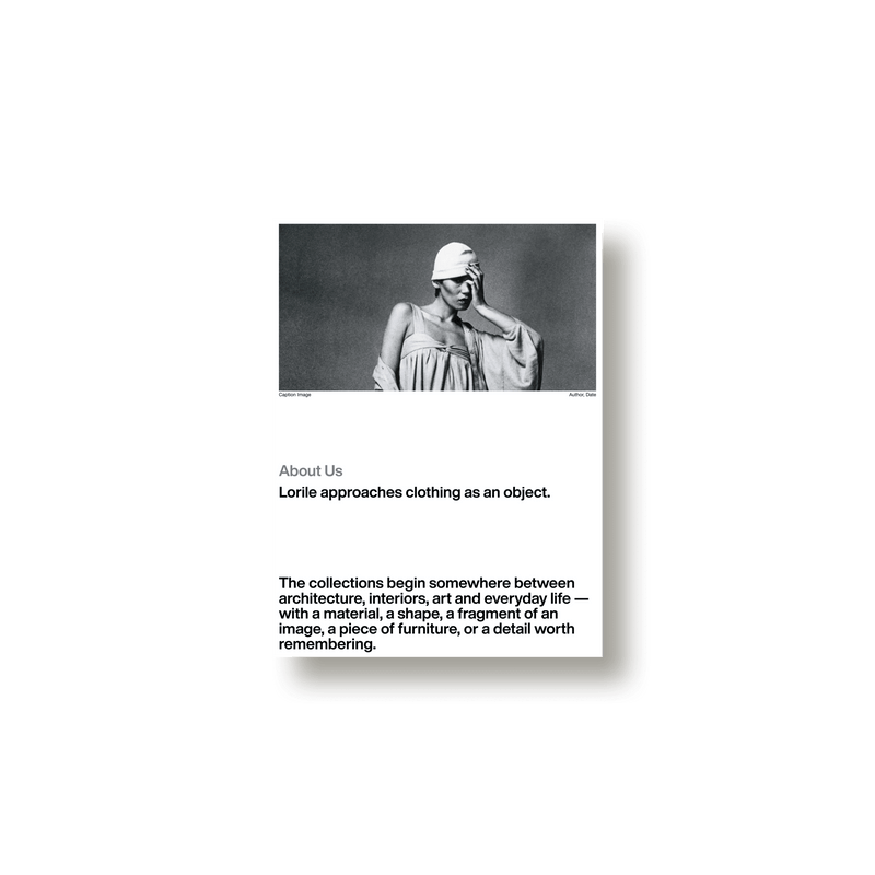
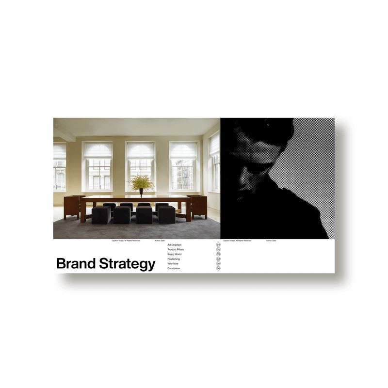
Interview

Lucie de Bréchard on Research, Restraint, and Leaving Room for Surprise

Lucie de Bréchard

Independent Design and Art Director
Profile

Lucie de Bréchard is a Berlin-based designer working across art, fashion, and the surrounding cultural sectors, providing in-house creative services across a variety of media. Her work includes creative and artistic direction, brand strategy and design, website design, publications and editorials. Clients include Tom Ford, the American Academy in Rome, Sweetwater Gallery and Metahaven.

Work by Lucie de Bréchard — Project 1 Work by Lucie de Bréchard — Project 1

Brand Identity for Sweetwater, gallery

Your work spans branding, editorial design, and digital platforms across cultural and fashion clients. How do you approach structuring a visual identity when it needs to move across these different formats?

I think I usually start in a pretty loose, instinctive way; just playing around with shapes, forms, and compositions until something clicks. It’s not super structured at the beginning, more about finding a feeling or a visual hook that has the energy I’m looking for. Once there’s that starting point, you can start thinking about how it behaves, how it scales, what happens when it moves into different formats.

And it’s rarely a straight line. I often end up going back and adjusting the original idea as I understand more about how it needs to function. Sometimes the thing you started with shifts quite a bit, and it can be hard to kill your darlings, but it’s also part of the process. There’s a real pleasure in getting to that point where everything clicks—where the same ingredients can be rearranged endlessly, something about setting up a language that can speak fluently in lots of different contexts.

What role does research play in your process, and how early does it begin?

To me research isn’t really a phase that starts and stops, but rather something that’s always running in the background.

I’ve been gathering and collecting images for as long as I can remember, back in the Tumblr days and still now. It became a daily habit, just saving references, screenshots, random details. It’s not always tied to a specific project either, it’s more like building this ongoing visual library that I can draw from later. Research becomes about connecting dots between all of those items, and then going deeper where needed depending of the project, whether that’s into a specific cultural context, a material, a type style, whatever feels relevant. It’s less about a defined step and more about a continuous way of seeing and working.

When developing a brand identity, what are the key decisions you return to across projects and the elements that tend to define the outcome?

I think here, first, research and references again. It’s less about looking for one clear answer and more about building a field of visual material to respond to.

But beyond that, a lot of the key decisions come down to where I’m willing to compromise and where I’m not. I often feel like my work is a a lot of negotiation; aligning with feedback, adjusting to different demands, but also slowly learning where it’s important to hold a line. That sense of judgment has become a big part of the process. There’s definite sadness in seeing a thing gradually getting diluted through small changes and micro-decisions. It’s rarely one big shift, more a series of subtle adjustments that, over time, can pull things away from what made it feel distinct in the first place.

I think that’s something I’m becoming more and more aware of—trying to protect that initial idea, or at least its core, so that we don’t need up with something that feels and looks like no one, a too many chefs in the kitchen type of thing

Work by Lucie de Bréchard — Project 2 Work by Lucie de Bréchard — Project 2

Invitations Design

Is there a type of project or design problem you find yourself returning to — something that continues to shape your practice over time?

One thing I’ve been noticing is that I’m always moving back and forth between minimalism and maximalism. It’s kind of a constant tension, like I am negotiating with myself. On one hand, I’m really drawn to reducing things down to their most essential form, where a few elements do all the work, but I do love when things feel layered, and even a bit excessive.

You’ve worked across both digital and print formats. Do you find your thinking shifts depending on the medium, or does the core idea stay intact?

I try to shape it in a way that it can work anywhere. That’s usually the goal from the beginning: not to design something that only lives well in one format, but something that can translate well.

And then there’s also something pleasing in introducing more unexpected or ephemeral formats along the way. Little moments that feel like a party favour—where you can show, “this could also exist like this.”. There’s a playfulness there, but it’s also actually useful because those moments become tests. They let me see if the system truly holds up when it’s stretched or very temporary or context-specific, then I know if the underlying structure is working. And if it doesn’t, it usually reveals quite quickly where the system is too fragile or too rigid.

Many of your clients including Highsnobiety and GOAT sit at the intersection of commerce and culture. How do you balance artistic expression with brand clarity and usability?

I’m quite interested in the space where something can be corporate without looking like it was designed purely to sell something. It’s important for me to make sure we are not making something that feels visually obvious. On the other hand, I also think it’s important that a brand doesn’t try to become something it isn’t. For example, a consumer brand doesn’t necessarily need to present itself as an art gallery or a cultural institution to feel sophisticated or considered. There is something much more compelling about embracing what the brand actually is and finding the most interesting way to express that. Looking into the archives of a company for example is often a way to find some treasures that have been overlooked for years — the original building the new offices are in, where the name comes from, who the founder was, etc.

That’s something I try to keep in mind in my own work, adding cultural and artistic references where they genuinely strengthen the identity, rather than using them as a kind of decoration or status symbol: It has to be completely believable as itself.

Work by Lucie de Bréchard — Project 3

Editorial Layout for Highsnobiety 'New Luxury New Rules' White Paper

"I’m quite interested in the space where something can be corporate without looking like it was designed purely to sell something."

What does editorial quality mean to you in a design context, beyond traditional publishing?

For me, editorial quality usually comes down to this ‘party favour’ thing I was mentioning earlier, leaving a few easter eggs here and there, all in a spirit of relatively silent playfulness: leaving some surprises and thoughtful details in what you show, what you leave out, how things are sequenced, how much space something gets, what sits next to what. Things that can be discovered as you go along the designed object, be it a pdf or an actual printed publication.

Can you walk through how you build a brand system that feels both structured and open enough for creative evolution?

I think the structure usually comes from defining a few things quite clearly and then being deliberately less prescriptive about everything else. So maybe type is pretty set and how we use it is strict and defined, but colours get a more open treatment, more options to choose from. I don’t think every possible application needs to be decided in advance, I actually like when a system has a bit of room for things to go wrong, or at least to surprise you.

In collaborative environments, especially with fashion or cultural clients, how do you navigate authorship versus collective direction?

I think I’ve become much more comfortable with the idea that a project can belong to a lot of people at once. There’s obviously still a point of view coming from the designer, and I think it’s important to have one, but the final thing is usually shaped by so many conversations, and there is something so incredibly joyful in working with people who have a completely different skill set from mine. I think it can be quite transformative for the way I work, because you suddenly see the same project through a completely different set of eyes. It allows different ways of thinking to actually inform your own practice. The difficult part is knowing which feedback is actually helping the project and which feedback is slowly pulling it somewhere else. So I think it’s less about protecting authorship at all costs and more about protecting the idea while allowing it to evolve through other people.

Work by Lucie de Bréchard — Project 4 Work by Lucie de Bréchard — Project 4

Art direction and Editorial Layout for 'Truths Not Trends', Neighborhood's White Paper

Looking ahead, what kinds of projects or formats are you interested in exploring that you haven’t yet fully engaged with?

I think I’d like to move further towards image research. I’ve always built these huge visual archives almost instinctively, so I’m interested in what happens when that becomes more of the actual practice—researching, finding, organising and contextualising images, rather than only using them as material for another piece of design.I’m particularly interested in working with archives and collections. There’s something quite exciting to me about the process of finding an image that you weren’t necessarily looking for and then following that thread somewhere else. I’d like to explore that more, whether through editorial projects, books, exhibitions, digital archives or collaborations with artists and cultural institutions. It feels like a natural extension of the research I already do, but with the image itself becoming much more central to the outcome.

Work by Lucie de Bréchard — Project 5 Work by Lucie de Bréchard — Project 5 Work by Lucie de Bréchard — Project 5

Visual identity for Outline

"That’s usually the goal from the beginning: not to design something that only lives well in one format, but something that can translate well."

Lucie de Bréchard: Lorile Social Media Kit