Interview

Kaitlin Banafsheha on Context, Heritage and Art Direction for Saint Laurent, Prada and Miu Miu

Kaitlin Banafsheha

Art Director
Profile

Kaitlin Banafsheha is an Art Director and Designer working at the intersection of brand, image, and culture. Her practice builds immersive visual worlds that position brands as living editorial entities—shaping identity through film, visual systems, casting, styling, fine art, and emerging image technologies. Each engagement is approached as a long-form authorship rather than a campaign, aligning narrative, aesthetics, and cultural relevance. With experience across fashion, technology, and cultural institutions, she brings an avant-garde, considered approach to creative and production, enabling brands to evolve with clarity and intention. She spent the larger first portion of the year as part of the creative team at Mazarine, and is now working as an Art Director in the fashion and luxury space.

She has collaborated with Saint Laurent, Prada, Miu Miu, Violet Grey, Cult Gaia, The Carlyle Hotel, Galerie on Sunset, The New York Philharmonic, Violette FR and more. Operating globally, her work extends to a network of trusted collaborators.

Work by Kaitlin Banafsheha — Project 1 Work by Kaitlin Banafsheha — Project 1 Work by Kaitlin Banafsheha — Project 1

Brand Identity for Laarch & Design

Your practice operates across fashion, luxury, hospitality, editorial and cultural institutions. How do you adapt your visual language to meet the distinct needs of each of these sectors?

For me it always starts with understanding the context of the project. Fashion and luxury tend to be more intuitive and image-driven, while cultural institutions or editorial projects often require more structure and clarity.

I try not to approach projects with a fixed visual style. Instead, I look at what the brand or institution is trying to communicate and build a visual language around that. The goal is always to create something that feels authentic to the client while still reflecting my own approach to typography, layout, and systems.

You’ve worked on brand identity and bespoke design systems for clients like Cult Gaia, what comes first in your workflow?

The first thing I focus on is understanding the brand’s perspective—what it represents culturally and how it wants to be perceived. Before designing anything, I spend time looking at references, researching the brand’s audience, and defining the core idea behind the identity.

Once that concept is clear, the visual system starts to take shape through typography, layout, and image direction. I’m usually thinking about how the identity will function across different applications from the beginning, not just as a logo but as a flexible system.

What tools or systems help you stay organized and maintain consistency across projects?

For me, staying organized is about creating a quiet rhythm in the work. Early on, I try to establish a visual language that feels intuitive, almost like a set of instincts. I want to build a storytelling world where the images, mood, type, texture, and lighting all feel consistent—like they belong to the same place.

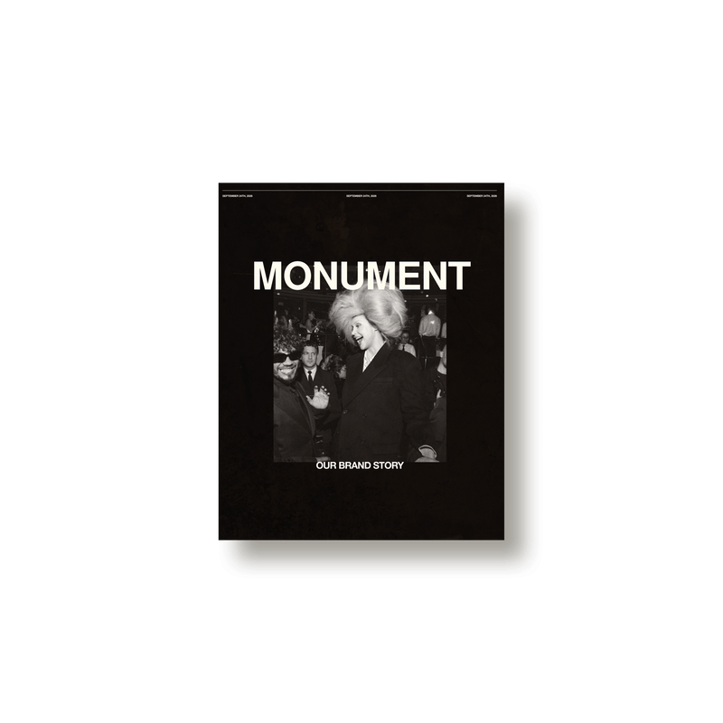
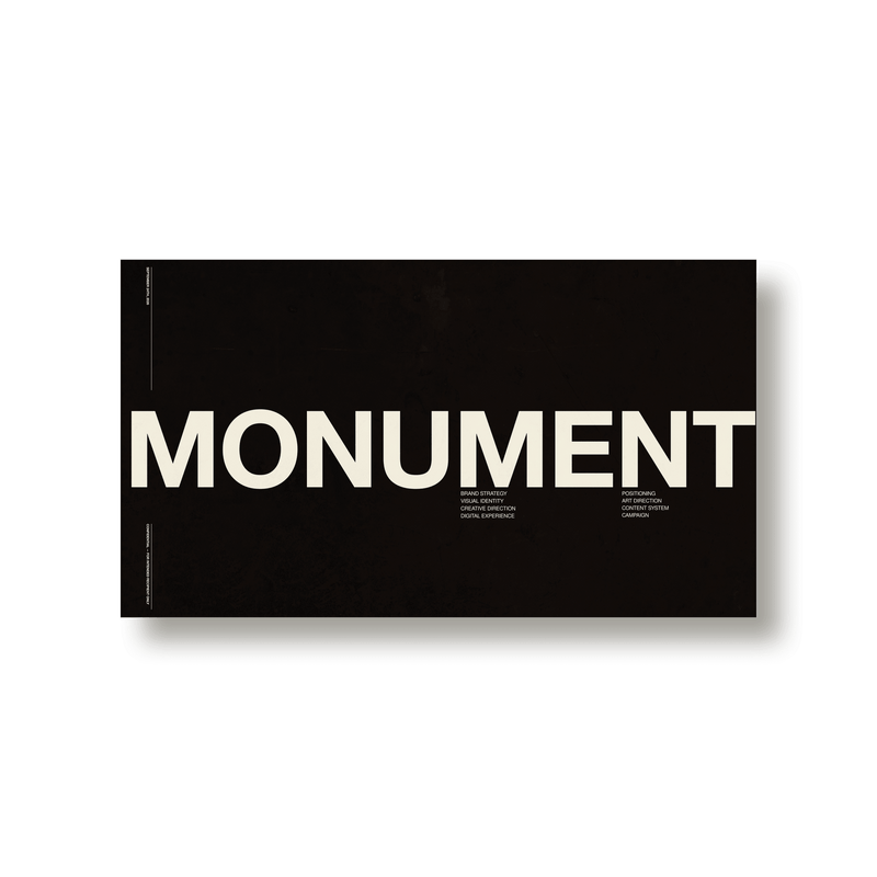
There’s still structure beneath it, of course, but I think of it as a foundation rather than a framework: something that supports the work without making it feel rigid. Tools like Figma help bring that to life, when we’re talking type and layout, and keynote when it comes to creative ideation and development. I can’t get enough of a basic Keynote deck. Somehow, it always comes back to a deck. Making sure my thoughts fit into a consistent, structured presentation helps me feel clear.

When the tone is set early, the rest of the project tends to unfold in a way that feels cohesive and effortless.

Work by Kaitlin Banafsheha — Project 2 Work by kaitlin-banafsheha — Project 2 Work by kaitlin-banafsheha — Project 2

Your work is grounded in studio art as well as design systems. How does your art background continue to shape your design decisions today?

My art background still influences how I think about design a lot. It taught me to pay attention to composition, texture, and the emotional side of visual work, not just the functional aspects.

Even when I’m working within a structured design system, I’m still thinking about balance, rhythm, shadow. That mix of intuition and structure is something I’ve carried with me from my art practice.

In your work for New York Philharmonic, Were there specific historical references, archival materials, or audience considerations that shaped your design decisions?

I worked on this project with Ogilvy, alongside a small team of two other designers and our design director, Jens Marklund. Working within that group, we were constantly balancing the Philharmonic’s history with the need to create something that feels current.

We looked at archival materials and past identities to understand how the institution has communicated over time, but a key reference for the system came from Lincoln Center itself—specifically the square that houses the Philharmonic. I remember literally taking a wireframe of Lincoln Center, printing it out, and tracing over it just to understand the exact shape and proportions. That process helped ground the identity in something very real and specific to the Philharmonic’s home.

From there, the focus was on making sure the system felt flexible and relevant today—something that could support a wide range of programming while still holding onto that sense of context and history.

In projects involving editorial or experiential design, such as look-books and campaigns, how do you balance editorial rigour with brand expectations?

I start by coming back to the research phase before execution, looking for cultural references that genuinely resonate with the brand’s world—images, places, objects, and moments that capture its mood and point of view. Those references help shape the visual story and give the work a sense of direction. From there, I think about pacing, hierarchy, and how someone moves through the content. The brand keeps everything aligned, informing choices around typography, layout, and tone, while still leaving room for variation and expression. When the research and editorial structure work together, the result feels considered and culturally grounded, while remaining clearly connected to the brand.

Work by Kaitlin Banafsheha — Project 3 Work by Kaitlin Banafsheha — Project 3 Work by Kaitlin Banafsheha — Project 3

"The goal is always to create something that feels authentic to the client while still reflecting my own approach to typography, layout, and systems."

How does cultural context influence your creative decisions, particularly when a brand has a global presence?

Cultural context shapes both how I understand a brand and how I make creative decisions. I pay attention to what’s happening now, but also to the broader cultural landscape: design movements, art, exhibitions, what’s currently on display, and the people shaping conversations—from brand ambassadors to celebrities. Those references help me understand the visual language and mood of a moment, and what might resonate with an audience.

For a global brand, that awareness is especially important. What feels relevant in one place may not translate the same way elsewhere. I try to build on a clear core identity while staying open to the local references, perspectives, and nuances that make the work feel meaningful in each context.

With projects like The Carlyle Hotel, how do you translate an existing brand heritage into contemporary design expressions? What are the constraints and freedoms of heritage work?

With heritage brands, I see the process more as interpretation than reinvention. The first step is understanding what makes the brand historically significant and what elements people already associate with it.

Those constraints actually become helpful because they provide a framework for the design. The goal is to preserve the character of the brand while introducing subtle updates that make it feel relevant today.

As your studio expands across different mediums, identity, digital, print, experiential, how do you maintain authorship while collaborating with developers, photographers, and external creative teams?

For me it’s about establishing a strong conceptual direction at the beginning of the project. Once the core idea and design system are clear, it becomes much easier for collaborators to contribute while still maintaining a cohesive result. I see collaboration as an important part of the process. Different disciplines bring different perspectives, and that usually leads to stronger work overall.

Work by Kaitlin Banafsheha — Project 4 Work by Kaitlin Banafsheha — Project 4 Work by kaitlin-banafsheha — Project 4

Looking forward, how would you like to evolve your studio — in terms of collaborations, mediums, or the types of clients you’d like to work with in the future.

I’d like to continue expanding across different mediums—especially projects that connect identity with spatial, digital, and more narrative-driven work. I’m particularly interested in moving further into more film and brand campaigns, as well as exploring how studio art, painting, photography, and set design can come together as part of a larger storytelling process.

In terms of collaborations, I’m drawn to working with cultural institutions and legacy brands that value long-term design thinking. Projects where there’s room to build something layered and considered over time are always the most interesting.

Work by Kaitlin Banafsheha — Project 5 Work by Kaitlin Banafsheha — Project 5 Work by Kaitlin Banafsheha — Project 5

"I try to build on a clear core identity while staying open to the local references, perspectives, and nuances that make the work feel meaningful in each context."

Kaitlin Banafsheha: Monument Social Media Kit